
Unearthing the Screams: Chamber of Chills #19 (Sept. 1953)
- PS Artbooks

- Nov 14, 2025
- 5 min read
Updated: Dec 19, 2025

Thirty-six pages of creeping shadows and graphic tension, Chamber of Chills #19 (published by Harvey Comics, September 1953) stands as a vivid artefact of the early 1950s horror-comics boom. According to the Grand Comics Database, the issue runs 36 pages, cost 10 cents at the time, and lists editing by Leon Harvey.

Lee Elias – The Iconic Cover Maestro

Born Leopold “Lee” Elias in Manchester, England on May 21, 1920, and later moving to the U.S., Elias studied art at the Cooper Union and the Art Students League in New York. He cut his early teeth in the 1940s for publishers like Fiction House drawing features such as Captain Wings and Firehair.
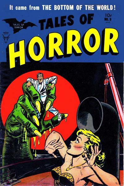
By the late 1940s and early 1950s he was working for Harvey Comics and other publishers; his best-known superhero work includes Black Cat. For Chamber of Chills #19, Elias is credited with pencilling and inking the cover. His cover style here is striking: strong contrasts, dramatic composition, a sense of looming menace — all visual hallmarks of horror-comics covers of the era, but elevated by his clean linework and cinematic layout.

In the PS Artbooks facsimile edition, that cover is preserved with meticulous fidelity. The colours, typography, paper stock and layout replicate the 1953 original as closely as possible, allowing modern readers and collectors to experience the book as magazine-stands presented it seven decades ago. The cover isn’t just a “pretty wrapper” — it is the gateway to the atmosphere of the entire issue.
Howard Nostrand – The Macabre Interior Craftsman

Howard Nostrand (May 13 1929 – August 1 1984), an American cartoonist born in Hoboken, NJ, worked as a background/ink assistant in the late 1940s before evolving into a horror-comics specialist. He joined Harvey Comics, where he drew for titles including Tomb of Terror, Witches Tales, and Chamber of Chills. Nailing the mood of post-war anxiety and supernatural dread, his art often mirrored stylistic innovations of the EC school of horror.

In issue #19, Nostrand is credited with the tale titled “Chilly Chamber Music” (a one-page piece) as both penciller and inker. Nostrand’s work helps anchor the interior of the comic in a world where the twist ending and grotesque visuals play off one another. In the PS Artbooks edition, each interior page is faithfully reproduced: the lineweights, the screen-tones, the gutters and page margins all adhere to the original. That means the flick of a page, the texture under your fingertips, evokes the original mid-century reading experience.
Joe Certa & Jack Sparling – Supporting Stylists


Joe Certa (1919-1986) is cited in records as a comic-illustrator active in the mid-20th century. Though less is widely written about him (compared to Elias or Nostrand), his presence in the interior credit list — for the story “Garzan the Magnificent” pencilled by Certa — attests to his role in this issue. Jack Sparling (1916-1997), a Canadian-born artist, had a lengthy career across strips, comics and licensed adaptations. In Chamber of Chills #19 he handles the story “Black Passion” as both penciller and inker.

The PS Artbooks facsimile edition doesn’t simply reprint the main headline creators — it reproduces the entire blend of talent within the issue, keeping full creator-credits intact, preserving the original story order and presentation. For a collector, that means you hold the same package of art-voices that the 1953 reader encountered.
Cultural Resonance & The Misfits Connection
Horror comics in the early ’50s operated in a twilight zone: post-war America, rising suburbia, anxieties about otherness and the unknown. Visuals of skeletons, other-worldly monsters, uncanny landscapes — they tapped into an aesthetic of fear, transgression and spectacle.

Fast-forward to the late 1970s and you find the punk band The Misfits borrowing that exact visual language: skeletal skulls (think the “Fiend” skull), horror-movie imagery, the juxtaposition of teenage nihilism and macabre iconography. The spacing, the starkness, the ghoulish appeal — it all loops back. One could argue Chamber of Chills #19 is part of the visual genealogy that informed the album covers, flyers and DIY posters of horror-punk bands.
The facsimile edition brings that heritage into sharp focus: this isn’t just nostalgia, it’s cultural DNA. When you flip through the PS Artbooks version you can trace a line from 1953 comic-stands to 1978 basements, from pulp-horror to punk-raw, from Lee Elias’s pen strokes to the skull-logo tee. It invites you to see how the aesthetic migrates and morphs but retains its spine-tingle.
Why the PS Artbooks Facsimile Edition Matters
Collectors know there’s a difference between “retro reprint” and facsimile edition. PS Artbooks positions this version of Chamber of Chills #19 as a near-exact recreation: same page size, same interior pagination, restored cover colours matched to original pressings, production values that honour the original rather than simplify or modernise. That means:
The reader sees original ads, mastheads, house-style lettering and story layouts as they appeared in 1953.
The tactile experience: the look and feel of the paper, the binding, the reading flow—all consciously designed to echo the vintage.
Archival value: for researchers, historians, aficionados of comic-book art, this edition becomes a reference—not just a “nice thing to read”.
Display and preservation: for the collector who values both form and context, the facsimile sits alongside actual vintage copies but without the immediate fragility or cost of an original.
In short, if you love the era, love the art, or simply want to climb inside the mindset of early-1950s horror comics, the PS Artbooks edition is more than nostalgia—it’s immersion.
Why It Still Haunts Us
If you’re picking up the PS Artbooks facsimile of Chamber of Chills #19, you’re not just getting a comic book relic. You’re holding a visual time-capsule where artists like Lee Elias, Howard Nostrand, Joe Certa and Jack Sparling did more than tell ghost stories; they built a visual grammar of fear that would ripple out into pop-culture in unexpected ways.
With the cover’s dramatic flourish and interior pages’ creeping dread, this edition invites collectors, historians and horror-fans alike to dwell a little in that uncanny zone. The next time you see The Misfits skull-logo on a T-shirt or a poster that evokes vintage horror comics, you’ll know the roots trace back — to that 1953 Harvey comic — and to the artists who crafted the aesthetics that haunted the foreground.


Comments